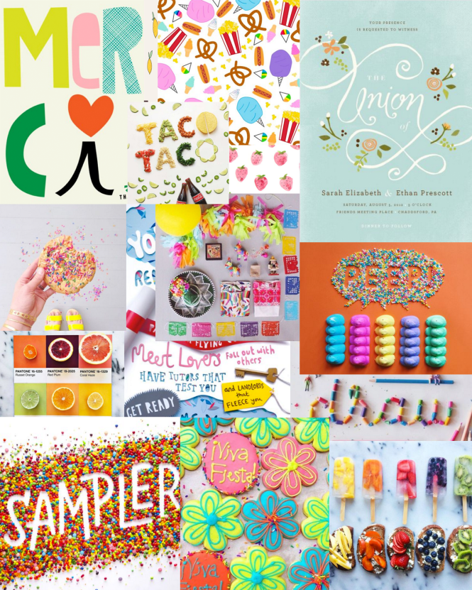
Back when I started my blog, I had some design experience, but not much! I created my blog design a year ago in February with a modern and classic design in mind. Since then, I still love my design, but I feel like my personality has changed a bit and I have a bolder taste in colors. I took my old design and updated it a bit, in part after taking inspiration from my graphic design Pinterest board.
I first created a vision board by taking screenshots of a lot of my favorite graphic design pins and arranging them how I liked. After, I found a common theme of hand-drawn graphics, sharp photography, and bright colors.
 images via Becca Clason, Peyton Perry, Sophie Ledesma, Lucia Litman
I definitely recommend creating a vision board or a board on Pinterest when you’re designing anything. It helps you find a common theme with the colors and photos that you usually gravitate towards. My design taste has changed a ton since I first created my blog, so I was due for a redesign.

The biggest difference that I think you can see with my old design and this new one is the color scheme. These colors are so vibrant and make everything bolder. I kept the typefaces the same, but I changed my patterns and my header to reflect the hand-drawn aesthetic.
What’s your favorite thing about the new design?
xo, Hannah


3 Comments
I think I’m going to have to do this. That’s great that you put a bunch of screenshots together which really gave you a cohesive theme. I love it!
Thanks Divapinks! Let me know how it goes!