October Favorites | 2017

Today I’m back with a recap of my October favorites. Hope you enjoy!

Youtube happenings

I finished my bid day video! It took a long time to go through and edit, but I’m really pleased with the final product. I also made a video all about what’s in my backpack. I love watching those and had fun filming it.

I’m also doing a lot more hands-on work with my job in football and I’m trying to create more videos for our Twitter feed. This one is one of my favorites, if you want to check it out!

Songs I’m loving…

This playlist is definitely all over the place, but hey, I never claimed to be a DJ ¯\_(ツ)_/¯ It’s definitely based off of Charlie Puth’s new song, How Long. I saw him open for Shawn Mendes this August and I’ve been kind of obsessed ever since.

Side note: I can’t wait for Taylor Swift’s album to drop this week (Friday)!! I’m a huge fan and I’m loving her new music.

Posts from October

Gameday Outfit with Wrap Necklace

Friday Faves | 10.6.17. 

September | Hannah’s Book Club

Recap into my life

1: As the weather drops, I’ve been dressing a lot nicer! It’s so easy to throw on a t-shirt and shorts for class but the cooler weather forces me into sweaters and jeans. I’m planning out more style posts so look forward to those on the blog soon!

2: I signed up for a half marathon…(!!) I’ve been loving my running class and the feeling I get after accomplishing a run, so I wanted to sign up for a race that would give me something to work towards. I even scheduled my classes around this for next semester so I’ll have time during the day to train. I’m excited but definitely nervous!

3: For my latest design project, I redesigned a record album cover for when Nirvana performed at the University of Kansas before they really ‘made it big.’ At first, I was so opposed to this project and couldn’t tell you one Nirvana song from another. I’m still not a huge fan, but I definitely have a newfound appreciation for their music after this project.

Thanks for reading! 

xo, Hannah

Continue Reading

Friday Faves | 10.6.17.

I’m so ready for October and to be done with September. I’ve planned out my classes for next semester already and truthfully, I’m feeling ready for next year.

1: I finished my first design projects of the semester! I’m looking forward to sharing more of my work on my blog as I finish my projects. Subtle plug…if you’re a designer too, follow me on Behance!

My first project is a type poster advertising Rio’s Carnival. We were only allowed to use type, color and scale in the design.

The second project is a re-branding of London Heathrow’s airport. When making the logo, we could only use the airport code — LHR — using only one font. This was my first project in my type design class and it was definitely interesting to struggle through using Adobe Illustrator.

Right now, we’re working on an album cover in one class and a magazine spread in the other class. I can’t wait to share the final results.

2: Speaking of next year, I just signed a lease for living in a house for my senior year. It’s crazy to think about senior year already, but I’m excited to be living out of my sorority house. This will be the first time I’ve had my own room again since high school, and I’m already thinking about decorating.

While the house will look nothing like these homes on my Pinterest board, I can still dream…

3: I wrote a new blog post this week: September | Hannah’s Book Club. Let me know if you liked it — I enjoyed writing it and would love to write more book reviews (maybe a little more comprehensive next time).

4: As the weather finally gets cooler, I’m looking forward to breaking out fall styles. I’m loving this moto jacket and the idea of styling it, but truthfully, if it’s not a shade of blue or red, it probably won’t match my closet…

This sweater is definitely up my alley and looks so cozy. This bomber jacket (in navy, of course) would be a fun addition to my closet for the fall too. It’s a little edgy and certainly different from my typical preppy style, but I think I could create some interesting outfits with it.

Thanks for reading!
xo, Hannah


Continue Reading

Andrew Kuttler | Inside the Insta

Today I’m sharing an interview with Andrew Kuttler, a designer and photographer with over 66k followers on Instagram. He actually went to my college, the University of Kansas (rock chalk!), so this was the perfect opportunity to interview him.

What’s your favorite thing about Instagram?

As a designer, I love being able to share and curate a visual story. Instagram is the perfect platform to get yourself out there and show off your work. I look at it as a mini-portfolio.

What do you take your photos with?

I mainly shoot with my Ricoh GR for personal work. For Boomerangs and still videos I use my iPhone!

What three words would you use to describe your style on Instagram?

Colorful. Graphic. Surreal.

Who are three people on Instagram that you admire?

This changes all the time! So many talented photographers and designers are sharing their work on Instagram. Right now, I’m super inspired by…

@tashalakoz (Tasha Alakoz)

@chriscreature (Christopher Hainey)

@drcuerda (Daniel Rueda)

Where do you find your inspiration to take photos?

I’m a sucker for research and planning ahead. A lot of the locations I use for personal and client work are hours away, sometimes even a plane ride, so it’s important to put in the time to make sure you have a strong concept. I love hanging out at bookstores and going through photo books and magazines—they always provide great inspiration.

What was the most important thing you learned in college?

Be open! And that design can have many different applications. You never know where your path will lead and KU gave me an incredible foundation.

When did you first start collaborating with brands solely through Instagram?

3 years ago! I had been working at various ad agencies around Los Angeles and was really craving more creative freedom. A big brand reached out to me and after pulling out the project with them, I felt the confidence to go out and take a leap on my own.

What is your favorite brand collaboration that you’ve done so far?

I love clients that take me to new locations—I feel the most inspired and come alive creatively when I’m in some place that I’ve never been. I think working with Pixar at their campus in San Francisco for The Good Dinosaur and Inside Out was a big moment for me. I was surrounded by people doing the most amazing things and I’ll never forget the experience.

Thanks to Andrew for talking with me!

xo, Hannah

Continue Reading

How to Make a Flashing Text GIF in Photoshop

How to Make a Flashing Text GIF in Photoshop

GIFs are seen constantly in today’s media—they’re used in social media, every listicle ever, even texts! Before they were really a ‘thing,’ I learned how to make these in my high school freshman year photo class. I’ve been doing them for fun for a while now. This tutorial will walk you through creating a flashing text GIF in Photoshop step-by-step so you can easily do it.

Create the original words

Open a blank document. I’m creating this GIF for Instagram, so I’m making it in a 1000 pixel by 1000 pixel square, but you can customize this size easily.

Start with a solid colored background. I’m using this hot pink because it’s bold and stands out easily.

How to Make a Flashing Text GIF in Photoshop

Save the photo. Then add text on the photo, one word at a time.

How to Make a Flashing Text GIF in Photoshop

Continue adding the words you want.

How to Make a Flashing Text GIF in Photoshop

How to Make a Flashing Text GIF in Photoshop

The words are finished! Make sure each file is saved as an individual .png in a sequence.

Change the words into a color gradient

Once you have all the words written on the image, start creating your color gradient. You’ll save the files in a sequence exactly like above.

I went with a blue gradient. Start by changing the top word to the lightest color.

How to Make a Flashing Text GIF in Photoshop

Continue with the rest of the colors. I used a cornflower blue, cerulean blue, then a navy.

How to Make a Flashing Text GIF in Photoshop

How to Make a Flashing Text GIF in Photoshop

Again, make sure each step is saved as a separate file each time you alter the graphic. You should have 7 files total by now if you’re following the same steps as I am.

Save the color gradient in reverse

Save the files in reverse. Even though it’ll be the same design as above, you need to save another copy of the file.

To do this, I’ll change the color of the word ‘this’ to white.

How to Make a Flashing Text GIF in Photoshop

Continue until all the words are back to white.

How to Make a Flashing Text GIF in Photoshop

How to Make a Flashing Text GIF in Photoshop

You should have 10 files in total by now.

Load the files into a stack

In Photoshop, go to File > Scripts > Load Files into Stack. Select all the files that you want and click ‘okay’ to import all the files at once.

How to Make a Flashing Text GIF in Photoshop

This is what the layers panel of Photoshop should look like for you once all the files are imported. Make sure the layers are arranged in the order you want the GIF to go.

How to Make a Flashing Text GIF in Photoshop

Open the timeline

Go to Window > Timeline to view the timeline below the files.

How to Make a Flashing Text GIF in Photoshop

Click on the button that says ‘Create Frame Animation.’

*if it says Create Video Timeline instead, just click on the arrow to the right of it and select the Frame Animation option.

Convert the layers into frames

After the frame animation is created, click on the small panel (highlighted in pink below) and select ‘Make Frames from Layers.’

How to Make a Flashing Text GIF in Photoshop

This will convert all the layers into frames that you can easily use in your animation GIF. Your Photoshop should look like this.

How to Make a Flashing Text GIF in Photoshop

To make sure your GIF is on a loop, select the word ‘Once’ under the first panel and change it to ‘Forever.’

How to Make a Flashing Text GIF in Photoshop

It should now look like this.

How to Make a Flashing Text GIF in Photoshop

Adjust the times (and sequence if necessary)

This is based on preference, but I prefer the 0.5 sec time.

How to Make a Flashing Text GIF in Photoshop

I played the GIF and realized that my words were out of order. You can easily drag and drop to switch it up. I also deleted the blank pink layer to make the GIF run more smoothly. I ended up with 9 frames in total.

Your final panel should look like this.

How to Make a Flashing Text GIF in Photoshop

Save your GIF

Go to File > Save for Web.

Next, make sure your settings are correct. Select ‘GIF 128 Dithered’ for the preset.

How to Make a Flashing Text GIF in Photoshop

Make sure the Looping Options panel says ‘Forever.’

Save your GIF in your desired destination.

Final

Your final GIF should look like this if you followed my directions to a T!

How to Make a Flashing Text GIF in Photoshop

I’d love to see your GIF—tweet it at me @hannahwacamera or tag me in it on Instagram @hannahwacamera.

xo, Hannah

Continue Reading

5 Ways to Improve Your Blog Design

5 ways to Improve Your Blog Design

Your blog content may be spectacular, but if your blog design is lacking, then I’m not going to keep reading. I’ll be honest: ever since I started my graphic design major, I’ve gotten way snobbier about strong vs weak design. (Sorry ’bout it.) But you don’t have to have a degree in design to have a strong website! Here are five ways to improve your blog design for the better.

5 ways to Improve Your Blog Design

Make sure your text is readable.

I know writing in lowercase is cute, but it’s hard to read and your audience will click away from your website fast. Similarly, your text should be left-aligned. It makes your blog just look that much more professional. Along with that, your font needs to be pretty plain. That’ll make your design look a lot cleaner.

A cohesive color scheme is key.

It’s tempting to change color schemes based on what’s trendy or the seasons changing. However, it becomes something to keep up with when your blog design is constantly changing and your audience will get confused when they see a new website every time they click. I created a color palette in my branding graphic that I made for myself, and I use those colors all throughout my blog design, without fail.

Limit your categories.

Eight categories should be the maximum amount that you have on your blog. If I see too many categories on the sidebar, it’s incredibly overwhelming and probably not necessary. Categories are only meant to help direct your reader to related posts and help drive traffic to your blog.

Chill with the fonts.

Only select two-three fonts to focus on. You should have a serif font, a sans serif font and a decorative font. A serif font has the little ‘tails’ off the end of each letter and is good for big blocks of text. A sans serif font is good for standing out and for titles (though these can be alternated if done right). A decorative font is optional, but can be used for titles and emphasizing certain words in a graphic. Definitely don’t use a decorative font for text longer than five-ish words though!

Simplicity is stronger.

This is the number one rule of blog design! I can’t stand seeing a blog with a tiled picture in the background, distracting me from the writing immediately. Your content needs to be the main focus, so stick to a white background (or shades of white/cream). Make sure your logo doesn’t have an overwhelming amount of little images or text pieces as well.

These tips are simple but easy changes to make that can make your design look so much better!

xo, Hannah

Bonus- if you missed the first code for 20% off of my stickers with Redbubble, you can use the code draw-hannahcbettis through November 1st for 20% off!

Continue Reading

Redbubble Discount Code

Hi everyone! Some of you may not know that along with running a blog, I have a side business on Redbubble selling stickers that I design. Through November 1st, you can get 20% off with the code draw-hannahcbettis at checkout (and if you order six or more stickers, you can get free shipping as well)!

I just added several new stickers to my college section that are definitely worth checking out. Here are some of my top sellers!

1

2

(available for most dog breeds)


3

(available for most colleges)

I used to have sorority stickers, but they all got removed for copyright. Now I just have the Greek letters in the same script font as the college ones so you can make your own pairings.

Let me know if you order any, I’d love to see my stickers on your stuff!

xo, Hannah

Continue Reading

Branding and Blog Design: Updated

Back when I started my blog, I had some design experience, but not much! I created my blog design a year ago in February with a modern and classic design in mind. Since then, I still love my design, but I feel like my personality has changed a bit and I have a bolder taste in colors. I took my old design and updated it a bit, in part after taking inspiration from my graphic design Pinterest board.

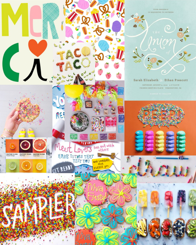
I first created a vision board by taking screenshots of a lot of my favorite graphic design pins and arranging them how I liked. After, I found a common theme of hand-drawn graphics, sharp photography, and bright colors.

Hannah With A Camera vision board images via Becca Clason, Peyton Perry, Sophie Ledesma, Lucia Litman

I definitely recommend creating a vision board or a board on Pinterest when you’re designing anything. It helps you find a common theme with the colors and photos that you usually gravitate towards. My design taste has changed a ton since I first created my blog, so I was due for a redesign.

Hannah With A Camera Blog Design Branding Board

The biggest difference that I think you can see with my old design and this new one is the color scheme. These colors are so vibrant and make everything bolder. I kept the typefaces the same, but I changed my patterns and my header to reflect the hand-drawn aesthetic.

What’s your favorite thing about the new design?

xo, Hannah
Continue Reading

Adobe Bridge Camera Raw Editing Tutorial + GIVEAWAY

feature image

Today I’m sharing with you a look inside my photo editing routine. I’ve done this post before, but I wanted to do an updated version now that I have a lot more experience and knowledge with playing with Photoshop and all it has to offer. Warning: this is going to be a photo-heavy post to help explain everything! I also have a giveaway at the end of the post, go check it out!

Adobe Bridge Camera Raw Editing Tutorial

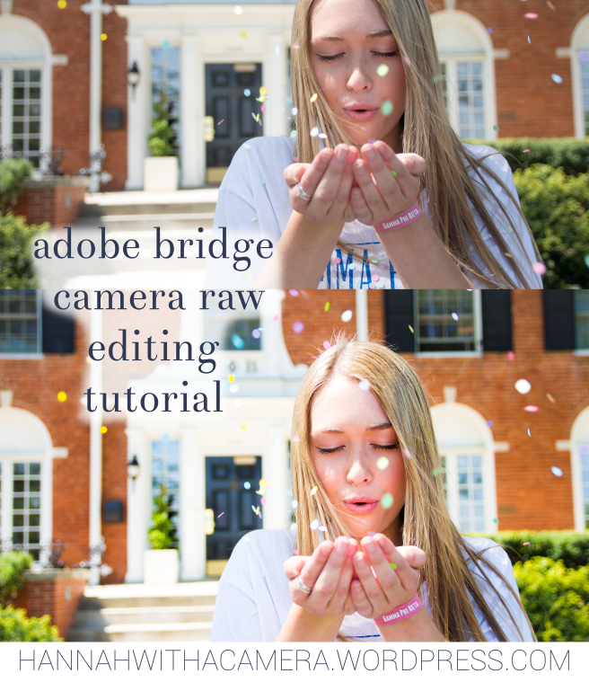
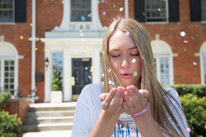
Above is the original photo. For this post, I’m using Adobe Bridge CS6’s Camera Raw function to edit my photos. I usually use Bridge for editing and then sometimes I’ll use one of A Beautiful Mess’s photoshop actions from the Fresh Collection for a final touch. I shoot every photo in Camera Raw. (I can do another post later on this if you all would like, but here’s a more in-depth explanation on why you should shoot in raw vs. jpeg.)

Adobe Bridge Camera Raw Editing Tutorial

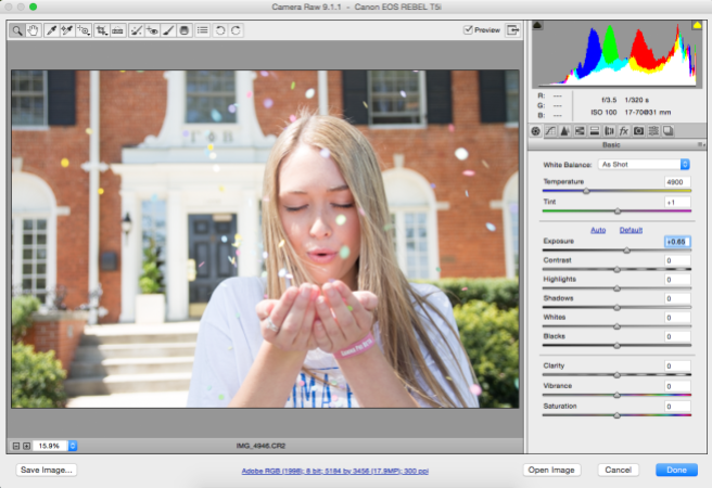
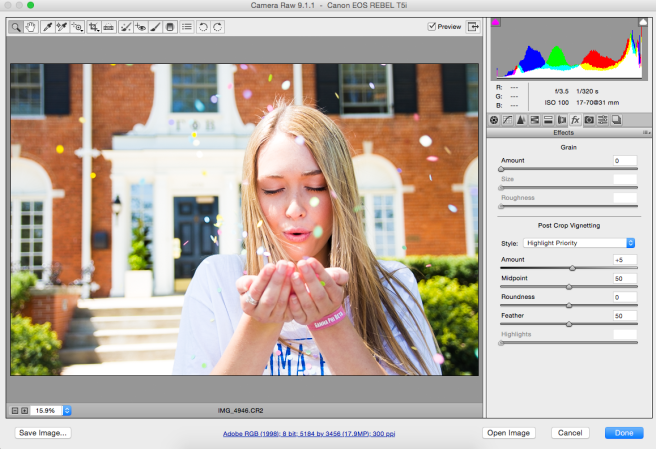
1) I started by increasing the exposure by +.65 to make the photo lighter. This is a step that a lot of people overuse, so be careful about your exposure usage!

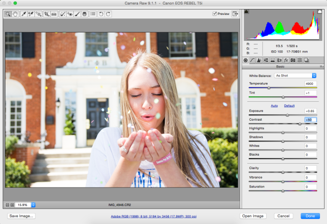
Adobe Bridge Camera Raw Editing Tutorial2. I increased the contrast by +50 to fix the fade that occurred when I lightened the photo. This draws out the dark tones and the light tones in the photograph, and you can tell it made a huge difference just in one step.

Adobe Bridge Camera Raw Editing Tutorial

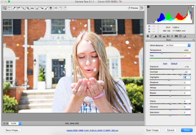
3) I decreased the highlights by -8. I shot this photo in direct sunlight, so I had to find a way to take out the glare caused by the harsh lighting.

Adobe Bridge Camera Raw Editing Tutorial

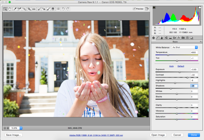
4) I decreased the shadows by -28. I say that I’m decreasing them because I’m referring to the sliding scale, but I’m actually making them more contrasted by drawing out the shadows. You can see the difference when you look at her hair.

Adobe Bridge Camera Raw Editing Tutorial

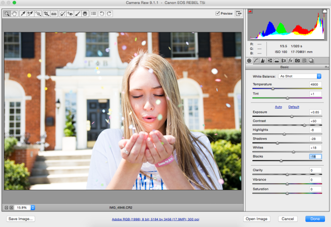
5) I increased the whites by +18. This isn’t making the whole photograph lighter like exposure, instead, it makes the whites crisper and sharper.

Adobe Bridge Camera Raw Editing Tutorial

6) I decreased the blacks by -18. This is the same process with the shadows–it’s not actually decreasing them, it’s drawing out the black tones in the photo to make it a lot richer.

Adobe Bridge Camera Raw Editing Tutorial

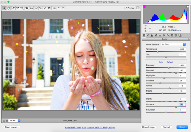
7) I increased the vibrance by +51. This is the step I messed around with the most to be sure it was just right, because it’s so easy to overdo it! Notice that I used vibrance and NOT saturation for this photo. Here’s why.

Look at the difference between these two photos. The one on the left looks like your elementary-aged cousin edited this on Picmonkey. Her skin is way too orange, and there’s no way her hair is that yellow. The one on the right, while still a little overdone, is much better. Her skin tone is even and looks natural, but the background is still rich and vibrant. The key here is using saturation (on the left) for landscapes and vibrance (on the right) for portraits. This is a huge mistake I always see people making, so please, for my sake, don’t do it.

Adobe Bridge Camera Raw Editing Tutorial

8) I increased the sharpening to +75. This feature is on the detail tab (third one) and I like to use it for portraits. (This is another classic example of landscape vs. portraits–when you’re editing landscapes, use clarity, when you’re editing portraits, use sharpening.)

Adobe Bridge Camera Raw Editing Tutorial

9) Last step! I increased the vignetting by +5. This is another step I see being misused all the time. I wouldn’t recommend going past +10 for portraits, unless you’re going for a really dramatic look.

Adobe Bridge Camera Raw Editing Tutorial

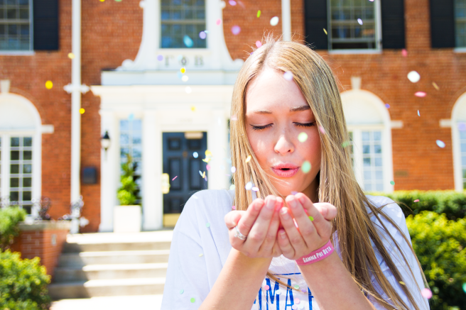
Here’s the final photo! This may seem like a lot of steps, but it didn’t take me long at all to go through and make my decisions in editing. It just takes practice to know what looks best on your photo.

You should go enter my giveaway for a sorority gift set on Instagram! Giveaway closes 4/27.

What’s your favorite photo editing tool?

xo, Hannah

Continue Reading

Thursday Threes

It’s only been two weeks since my last post, but a lot has happened! I’m currently on spring break and while I’m not relaxing by a beach or exploring a new city, I’m happy to be home with my family. Here’s an update on what’s been going on lately.

ONE

Viewbook
via sadp.ku.edu

I got accepted into the design school! My parents encouraged me to apply last minute (literally 6 hours before the application was due) and I just learned that I’ll be starting in the fall. I’ll be double majoring in strategic communications in the journalism school and graphic design (visual communications design if you want to be fancy) in the design school. I’ve been interested in the idea of pairing the two with creative advertising or working in the magazine industry lately, so I think this is a perfect fit for me. Plus, there are several amazing and innovative ad agencies in the area that I would love to move forward with a possible internship come junior or senior year. 

TWO

Untitled

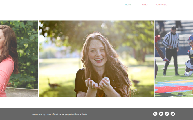
I updated my portfolio website to a cleaner, more colorful design. I’d love to upgrade my blog website to a WordPress domain with a customizable website, but right now I feel like I don’t have the time! A summer project might be in the works.

THREE

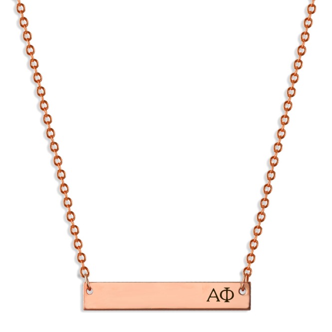
APhi-Sorority-Bar-Necklace-Rose-Gold

I can’t say a lot about this yet (I want it to be a surprise) but here’s a not-so-subtle hint with the picture! Keep an eye out for a future collaboration.

xo Hannah

Continue Reading

Branding and Blog Design

I’ve only been an ‘official’ blogger for a few months, but I’ve learned the importance of branding already. A while ago I created an inspiration board for my blog on Pinterest, and from that I created this branding reference.

Branding inspiration for Hannah With a Camera.

The inspiration for my color scheme came straight from my room. Turquoise, coral, navy and grey are all throughout my room, from the light turquoise walls to the coral accents. A peek into my closet proves my love for these bright colors!

I wanted both a modern and a classic feel, and the fonts reflect this. Theano Didot is a classic font inspired by Vogue magazine’s bold lettering. Anyone with some knowledge of graphic design knows that serifs are best mixed with san serifs, so I picked Roboto Thin. These two fonts are great free fonts for any design.

The patterns I chose help influence the classic feel of my blog. Stripes and polka dots will always be in style. The gold, in my opinion, adds a stylish touch.

Keep an eye out for my next post with tips on creating a brand board for yourself!

Thanks for reading,

navy monogram

Continue Reading