I’ve wanted a Day Designer for a while now, and when I saw that Blue Sky was releasing a daily version last year for Target I jumped on the opportunity. I absolutely loved having a to-do list built into my planner alongside my schedule. I had the large daily/monthly planner and while it definitely fit what I wanted, I ended up not using every single daily page and the coil started coming undone because I used it so much. Lucky for me, Blue Sky and Day Designer partnered up again to release more versions of their coveted planners!

I purchased the Monthly/Today & To Do in the 8×10 jade. I wanted the navy small version originally, but my Target only had the jade in the larger size and I’m glad I went with this one. The binding makes it easy to lay flat and I won’t have to worry about the coil coming undone this time.
The planner starts with a monthly view from July 2016-June 2017. I love being able to see my whole month at a glance, and it’s really helpful that each box is big enough for me to write a lot for each class if I need to. Typically I’ll write out my color key on the left in the to-do and notes section using my Staedtler triplus fineliner pens (these don’t bleed through the pages). I’ll then write important events in the monthly pages. For school, I’ll usually just write out big assignments instead of every single one–that can get cluttered fast!
This is the weekly layout, with Monday-Wednesday on the left side and Thursday-Sunday on the right. My favorite part about the Today and To-Do is that it’s undated, so if I have a break from school or won’t have enough to write for the whole week, then I’ll just rely on the monthly view. The undated planner also makes it much smaller than the daily is!
The weekly view has enough space to write in your schedule for the day on the left side and write in your to-do list on the right side. There’s fifteen weekly pages included. When I’m in school, I’ll write out my assignments that are due that day in the left column and what I need to finish in the right column. The Today & To Do also comes with two striped ribbons to easily keep your place.
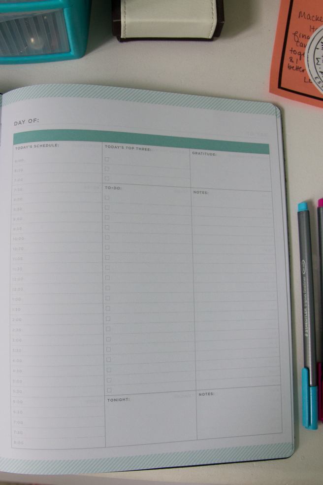
Here’s a look at the daily view! There’s 90 of these included. It runs from 6am-8pm (as if I get up that early…) and includes a small ‘tonight’ box to add in extra activities past that time. I love that it includes a box to write down what you’re grateful for each day. These pages also have a notes section to write down random things you need to remember throughout the day, but I’ve seen some people use this as a journaling section.
What planner are you using?
xo, Hannah










 images via

