Inside the Insta with Stripes and Peonies

I’m so excited to kick off the new year with a new series on my blog! Inside the Insta will highlight some of my favorite Instagrammers and take a look into their style and how they make their photos look so perfect.

gracey header

First off in this series is Gracey, a fantastic blogger in high school. She blogs over at Stripes and Peonies and I highly recommend you check out her blog. Her Instagram feed is filled with lots of bright whites, pinks, and blues. To get a insider’s look into her process of choosing her photos, just read on!

What do you take your photos with?

A large majority are taken with my iphone 5s, but I occasionally use my DSLR for outfit or travel instagrams.

How do you edit your photos?

I use VSCO cam, Snapseed, and the Photoshop Express app. Sometimes I use all 3 apps and sometimes I only use one. Usually my routine is: raise exposure and contrast, make it cooler, sharpen, and add my favorite filter.

What’s your favorite thing about Instagram?

I love that its a platform for me to share things I love and find beautiful and also it’s vastness. I can get lost in Instagram finding new photographers and accounts and I always leave with some inspiration.

gracey insta pic 3

What do you center your photos around?

I don’t have a specific theme…but, I do tend to photograph many flowers (usually peonies) and coffee.

What three words would you use to describe your style on Instagram?

Youthful, bright, and simple.

Who are three people on Instagram that you admire?

Some of my favorite accounts are @amy_stone @aguynamedpatrick @rubenhughes @besspearson @anyeske

gracey insta pic 2

Where do you find your inspiration to take photos?

I feel I am most inspired when I travel. Being in a new surrounding is the best because there are so many things to explore and photograph. I swear the moment I touch down in a new city, my number of daily instagrams goes from about 2 to 5.

How long do you usually take to set up a photo?

It really depends on what it is. If it’s like this one, it can be anywhere from 5-10 minutes. First I have to find the right light and then I have to take a bunch of photographs. I move things around, adjust the light, and try different angles before getting my desired shot.

gracey insta pic

Would you say you stick to a certain color scheme for your photos?

I try to, but not religiously. The color scheme also changes. If you scroll through my feed you will find a group of pink images, then move on to blue, then to neutral images. It really depends on my mood at the moment.

Square crop or full size, and why?
Square crop always! My phone is always set in that mode to ensure I can get everything in the frame. I would hate it to have a wonderful picture but then have to crop it into a square and loose some important elements.

Thanks for reading!

navy monogram

Continue Reading

Adobe Camera Raw Editing Tutorial

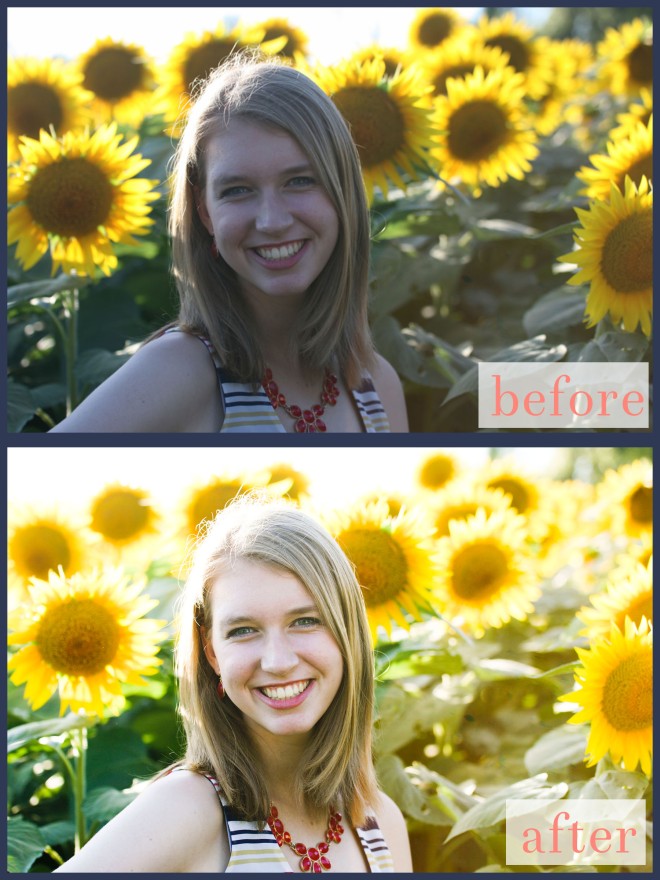
edit, don't fret it: before and after details of editing photos!

As a senior, I’ve been having my mom take photos of me at every opportunity. Instead of shelling out hundreds of dollars for one senior photoshoot that’ll represent me in only one season, we’ve been taking several afternoons to take pictures in different locations, with other people, new props, etc. While I can’t take the photos myself (thanks, Mom!), I’m the one who edits them.

edit, don't fret it: before and after details of editing photos!

We went to Grinter Farms in Lawrence, KS (my future college town!) this summer to take photos with the gorgeous sunflower field and I’m just now getting around to edit these. This field is incredible and I definitely recommend stopping by if you’re in Kansas in summer!

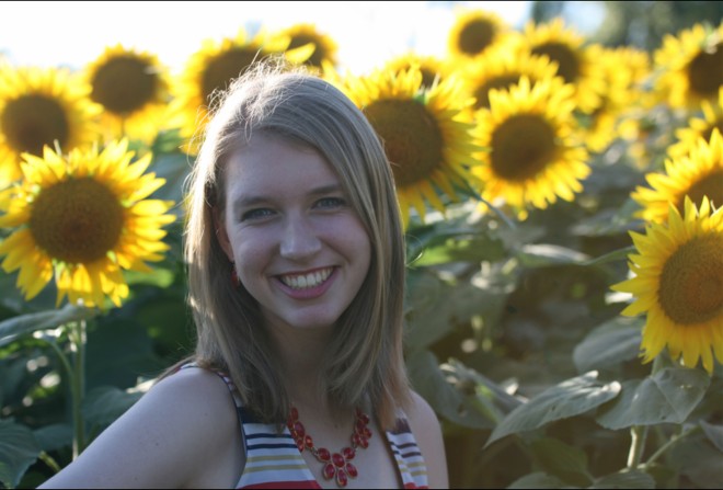
Original Photo

I’m starting with this photograph. The highlights are kind of blown out by the backlighting of the sun and the photo is cooler-toned overall. Not super summery.

1

I took this photo into Camera Raw in Adobe Bridge–always my first step–and turned up the exposure. While a full stop (+1.15) might seem like a lot, it was definitely necessary. The original photo washed out the details and value, so I then turned up the contrast. There’s a huge difference with the clarity of my eyes in the original photo and the edited photo. To make the photo less blue-hued, I turned the temperature up to give it a warmer, summery feel. I didn’t want to mess with the tint with fear of making my skin look too green or purple-ish.

No matter what photo I edit, portrait or landscape or still life, I always bump up the highlights and take down the shadows. I do the same thing with the whites and the blacks. This always gives me great contrast without looking too grainy. I was going to mess with the clarity, but it made my skin tone look weird. I only turned the vibrance and saturation up a tiny bit with fear of making the sunflowers look too fake and like a middle schooler edited it with a rainbow filter.

4

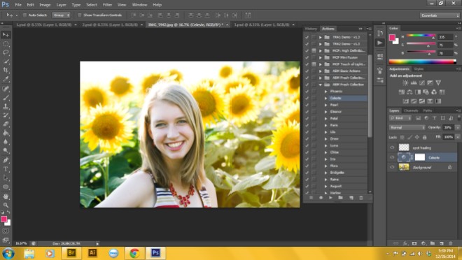
After making my primary edits in Camera Raw, I opened up the photograph in Photoshop. I used the Spot Healing tool on a few blemishes I wanted to remove on a new layer. Then, I used A Beautiful Mess’s Fresh Action, Celeste, to bump up the contrast even more. It was too much at 100% though, so I turned it down to 30%.

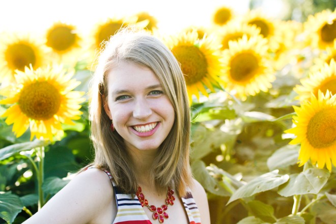
IMG_5942

Here’s my final photo! While it seems like this took a ton of time, it only took me about 3 minutes tops. If you have any questions just comment, I’d love to help!

navy monogram

Continue Reading

Plaid and Pearls

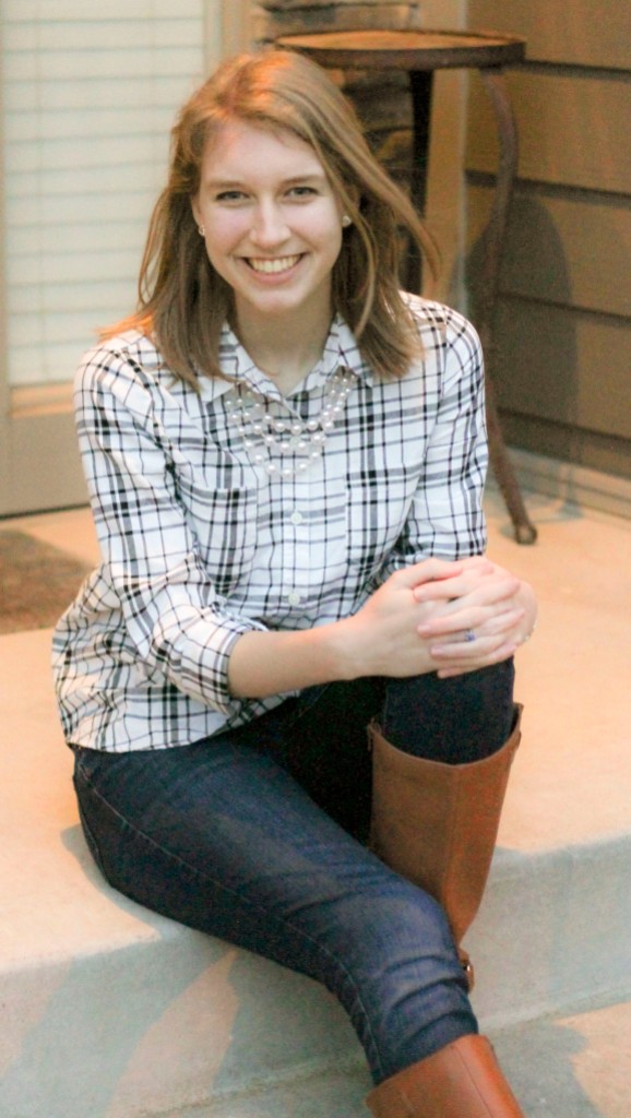
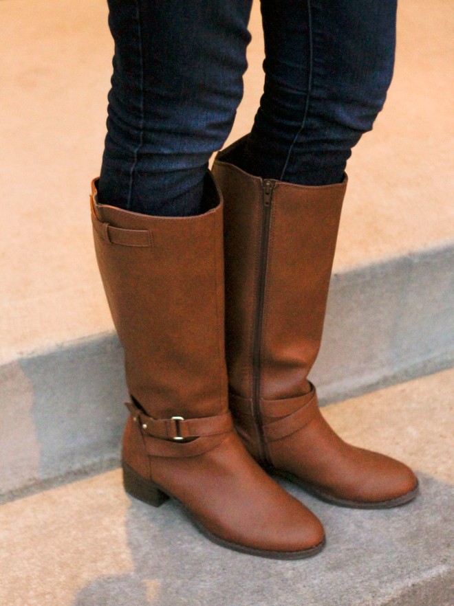
Merry (belated) Christmas to everyone! Today I’m sharing my outfit from yesterday’s festivities…about half of it was new Christmas presents 🙂

IMG_3675 IMG_3682 IMG_3683 IMG_3684

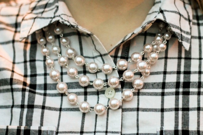
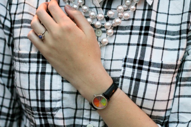
shirt (similar) // jeans // necklace (similar) // earrings // watch (I never ever take this off) // boots

It’s no secret that I love Old Navy and that’s clearly evident in this post. The necklace, earrings, shirt and boots are already favorites of mine. While looking for a link to this watch I got so, so upset–it looks like it isn’t made anymore! I’ve been wearing the same version of this watch for three years now. It’s from the Metropolitan Museum of Art in New York. The second ‘hand’ is a color wheel on top of the base of another color wheel that mixes colors when the wheel rotates. Hopefully I can find it again!

What’s your favorite Christmas gift?

navy monogram

Continue Reading

All About The New Instagram Filters

If you spend as much time as I do on Instagram (every day…oops?) then you’ve most likely noticed that five new filters were released two days ago. These are a lot more subtle than the other filters offered. I decided to try them all out and let you know what I thought!

All About the Instagram Filters

To test these out I used one of my favorite photos I took on my summer vacation to Monterey, California. This is McWay Falls off the Big Sur coastline–one of the best parts of the trip, fyi. I tried to use a photo with both warm and cool tones for my original photo, which I edited in Photoshop CS6 with A Beautiful Mess’s actions. I use the Fresh Collection all the time.

Slumber: This filter gave my photo a warm wash. I’d use this for more rustic photos or photos that you want less contrast and more brightness on.

Crema: This filter darkened my shadows more and added more contrast. It also gave my photo a little bit of a warmer tone, but not as much as Slumber.

Ludwig: In my opinion, this filter took the cool turquoise tone of the sea completely out of the photo and gave it less color. It made the sand look a lot less gray and more yellow-toned.

Perpetua: This filter is more for cool tones. I like this one the best because even though the cool tones were enhanced, the warm tones were too. This makes for a well-balanced photo.

Aden: This is a cooler-toned filter as well with more green in it than blue. Not my favorite, but still better than any of the other old filters 😉

What’s your favorite filter?

(Edit: after looking at Instagram today I realized that the Jamae filter was changed to the name Aden. This post has been fixed accordingly.)

navy monogram

Continue Reading

The Essentials in My Camera Bag

my camera gear

1) Canon EF 50mm f/1.8 II Camera Lens
This lens is the first upgrade I made in my own collection after my kit lenses. I love the bokeh that it gives and I think prime lenses are great for the cheaper price if you’re taking portraits. This works fantastic in low light.

2) Tamron AF 18-270mm f/3.5-6.3

The Tamron lenses aren’t mine, because I don’t have money flowing out of my pockets. However, I get a ton of use out of them (thanks Mom for letting me borrow)! This lens has a great zoom and is super sharp. It’s a great everyday lens to use in all sorts of situations.

3) Gracie Butterscotch
I am in love with this camera bag. I took it with me this summer to San Francisco and it was a great alternative to my ugly black camera bag that came with my camera. The color is super versatile (but the mint color is adorable) and this bag holds a ton, not only in the removable compartments but also in the roomy top and multiple pockets.

4) Tamron AF 60mm f/2.0

This lens is the love of my life. I’ve used it for several senior portrait shoots and the quality is incredible. It works great in low light situations and the colors turn out very crisp.

5) Canon EOS Rebel T3 with 18-55mm Lens + Canon EF 75-300mm f/4-5.6 Lens
This camera is my baby. I love the ability to do both video and photo and it’s a great entry-level DSLR, especially for someone like me who’s still learning! I got my camera as a Black Friday deal two years ago, but these are the same kit lenses that came with it.

Continue Reading

Fall Fashion

IMG_9697

IMG_9694

IMG_9698

IMG_9690

vest (sold out in red!) // top (similar) // jeans // socks (similar) // boots (similar)

As the fall weather turns brisk and the leaves start falling, I have to turn to layers to keep me warm. One of my new favorite ways to spice up a sweater or a buttondown is throwing a vest on the top. It’s a great way to pull together an otherwise-lacking outfit.

What’re your favorite kind of layers?

navy monogram

Continue Reading

Why This Blog Exists

This is my fourth attempt at a blog.

And I put it off, I swear. I declared that I had no time, that I wasn’t a good enough writer, but most importantly that I didn’t know what to write about. But then Carly of The College Prepster, one of my favorite bloggers ever, posted a list of 50 Ideas for Blog Posts and I couldn’t say no.

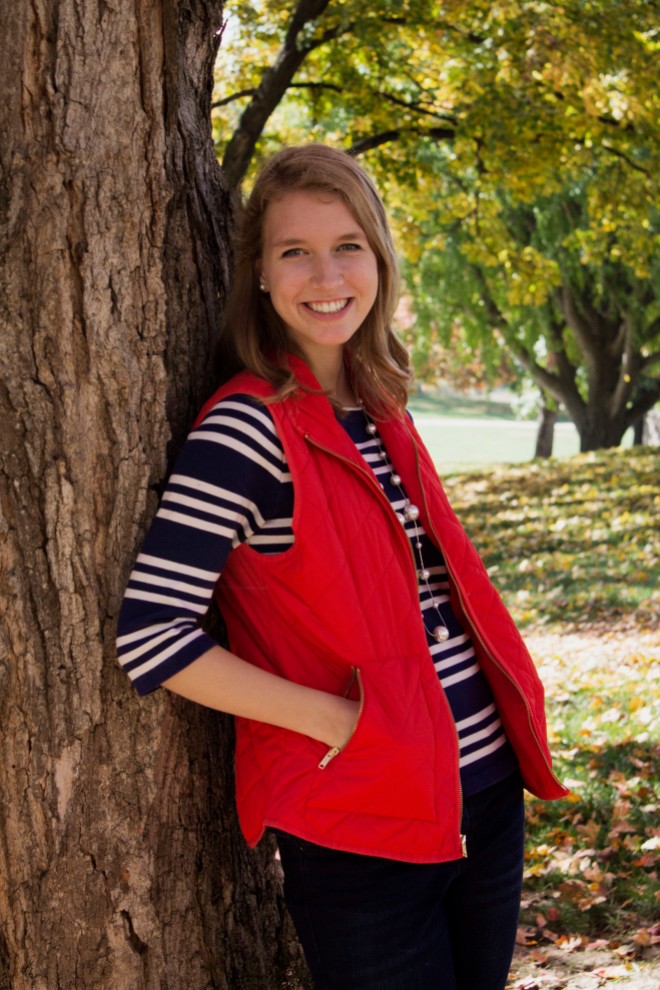
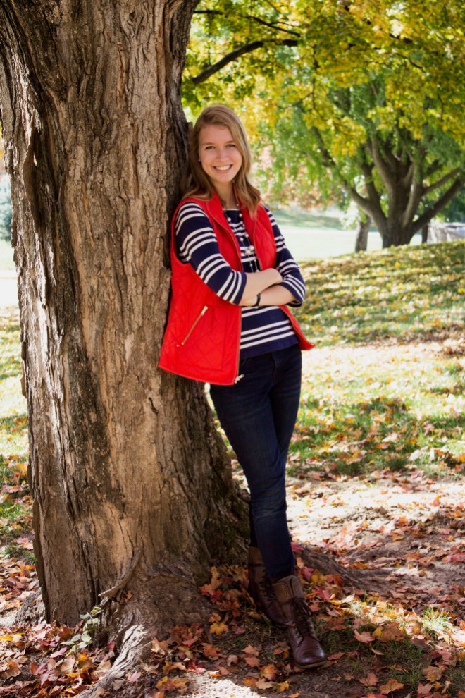
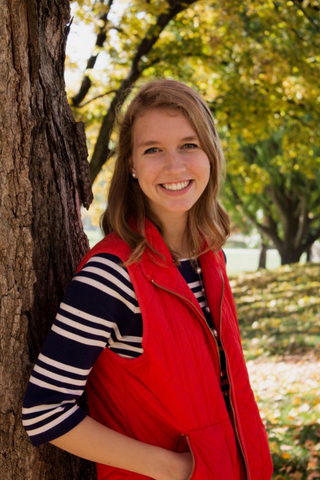
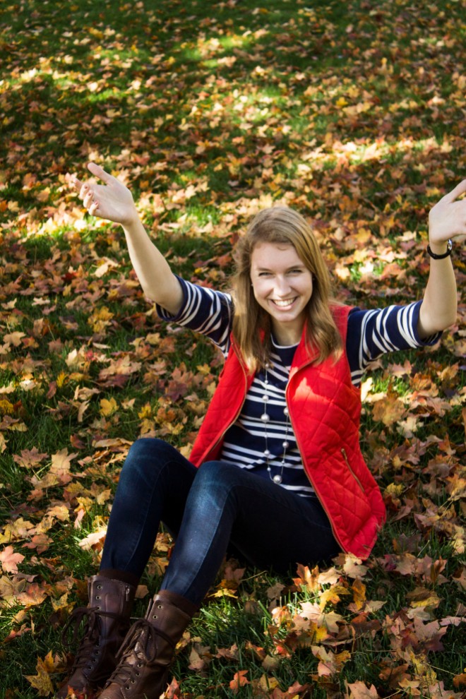
Without further ado… hi, my name is Hannah, and I look like this.

#50 on Carly’s list says to tell the story of why you started your blog and I figured this would be the perfect introduction post. I’m a high school senior and recently I started a daily series on my Instagram (@hannah_withacamera) called #theseniorchronicles and I’m currently 60 days in. I’m actually super impressed with myself that I’ve kept it up for this long. This blog is partly for myself, to look back on, and partly because I look up to bloggers like Carly and every other one that I have an email subscription to (I think I’m at 40+ and the number grows daily).

This blog is hopefully going to be a great creative outlet for me, both in writing and in photography, and I aim to post at least one article each week. I want this blog not to be a hassle that I feel like I have to post on, but something that I look forward to writing, something that sparks a constant interest in me to stay creative and keep making inspiring things, both for me and for others.

Wish me luck.

Continue Reading