It’s only been two weeks since my last post, but a lot has happened! I’m currently on spring break and while I’m not relaxing by a beach or exploring a new city, I’m happy to be home with my family. Here’s an update on what’s been going on lately.
ONE

I got accepted into the design school! My parents encouraged me to apply last minute (literally 6 hours before the application was due) and I just learned that I’ll be starting in the fall. I’ll be double majoring in strategic communications in the journalism school and graphic design (visual communications design if you want to be fancy) in the design school. I’ve been interested in the idea of pairing the two with creative advertising or working in the magazine industry lately, so I think this is a perfect fit for me. Plus, there are several amazing and innovative ad agencies in the area that I would love to move forward with a possible internship come junior or senior year.
TWO

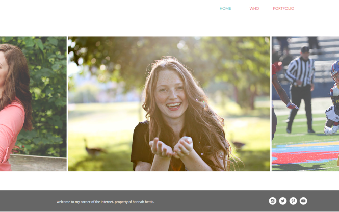
I updated my portfolio website to a cleaner, more colorful design. I’d love to upgrade my blog website to a WordPress domain with a customizable website, but right now I feel like I don’t have the time! A summer project might be in the works.
THREE

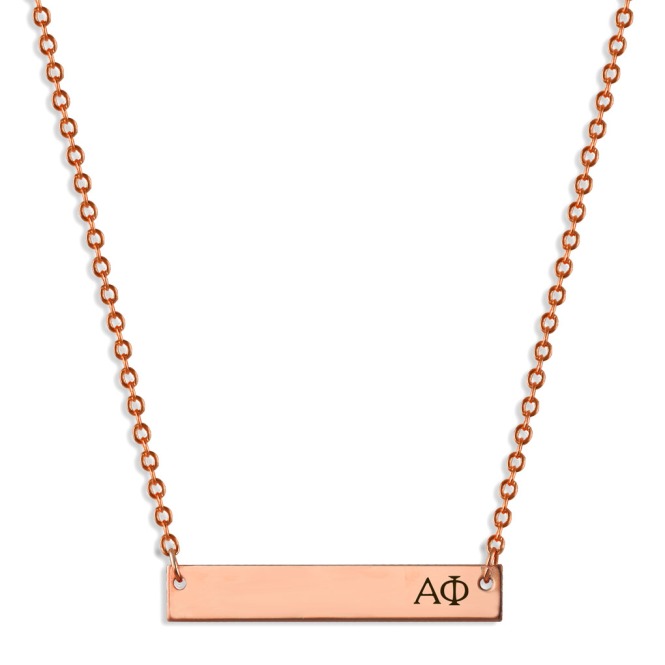
I can’t say a lot about this yet (I want it to be a surprise) but here’s a not-so-subtle hint with the picture! Keep an eye out for a future collaboration.
xo Hannah


